
By: Stacy Kildal
QuickBooks Online recently introduced an update to the Company Settings interface, and the updates really, really make things easier to edit.
Historically, all the settings have been located on one big page that you could just scroll through, or a giant list of short cuts on the left side of the page:

It sort of hurt my brain to deal with this.
The new look is in line with the new QuickBooks Online aesthetics, giving it the more up to date look, plus it’s organized much better so that it’s easier to do an initial setup or make changes down the road.
Accessing settings in new QuickBooks Online hasn’t changed. You’ll still click the Gear Icon (or company name) in the top right corner of any page, then choose Company Settings from the Settings column:

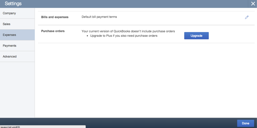
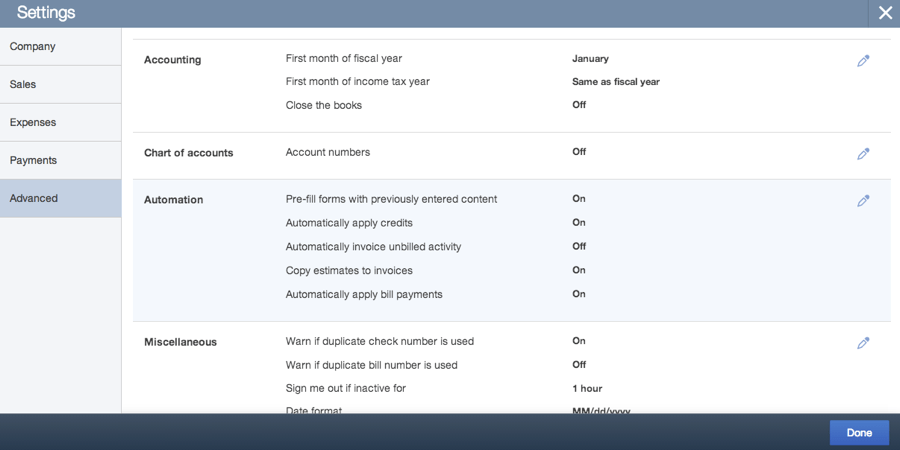
The first thing you’ll notice is that there are 5 sections, replacing the… I’m not really sure what phrase to use here… mess of headers? Seems as good as anything, so there you go. Anyway, there are 5 sections, Company, Sales, Expenses, Payments and Advanced, and I find that new QuickBooks Online users are able to jump to the sections they need to in order to get started as quickly as possible.
The first section, Company, allows you to edit the company name, contact info, reporting method, add EIN, as well as add a logo. Once you’ve made the changes you need, just click the big blue “Done” button in the bottom right corner.

The Sales section gives you options to Customize your sales templates (you can also do this directly from the forms themselves, and I have a detailed article on how to do that here). You can also choose whether you want to include certain information on these forms such as shipping, custom field, as well as turning on custom transaction numbers (this allows users to override the default reference numbers that QuickBooks Online assigns transactions), discounts, using service dates and customer deposits.
Other choices here are whether to show the products & services column on sales form or use inventory – this is the “Track quantity and price rate” – when you click that, the area will expand and you can click the option to Track Quantity on Hand.

The Expenses section is where you’ll be able to do expenses by Customer (for job costing), as well as turning on Purchase Orders and the preferences related to them (3 custom fields, custom message).
In the Payments section, you can either sign up to accept credit cards (My recommendation? DO THIS. I cannot believe it took me as long as it did to start taking credit cards from my clients, and with QuickBooks Online, you can automate this process, and make it so easy to get invoices paid. When you email them from QuickBooks Online, you can choose to let the customer or client pay online. They open the email and are able to click on a link to view the invoice and pay right then with a bank account or credit card. I love this. LOVE IT!). All you have to do is click “Learn More”
You can also connect an existing Intuit Merchant Service account (if you’re moving from QuickBooks Pro, Premier, Enterprise or Mac) from this screen as well by clicking “Connect”

The Advanced tab is where most accounting professionals will want to start. This is where you’ll set up the fiscal year, set the closing date (and password, don’t forget the closing date password!), as well as turning on account numbers.
Additional settings here are some miscellaneous ones that don’t fall within the Company/Sales/Expenses categories – they’re more general use options. Date format, warnings about duplicate transaction numbers, automatic sign out, etc.
I wasn’t going to mention it, but I might was well – the ability to search via CTRL + F has been removed, but I didn’t notice until it was brought to my attention. The redesign has pretty much eliminated the need for it, because it’s not one big mash up of everything on one long page. Just my opinion, I’m sure some people will disagree, but it’s all good, right?
One last thing to mention with this update is that it’s FAST. No more waiting for the page to load; the QuickBooks Online development team overhauled the page to improve the overall architecture and has been retooled so that it looks good and works well on mobile devices.
